What's Wrong With Still Waiting For Greenhouse?
Welcome! This site aims to address misinformation that appears on the Internet in relation to Global Warming (also called the Greenhouse Effect). In particular, it seeks
to expose errors of fact on one particular site -
Still Waiting for Greenhouse.
Still Waiting for Greenhouse was started by John Daly in 1996 and was run by him until
he died in January 2004. Still Waiting for Greenhouse continues to be run by his family
and associates but is now only a shadow of its former self, apparently intent on posting `exciting' items such as
Updated El-Nino/Southern Oscillation data! In a perverse way, the present Still Waiting for Greenhouse
is a tribute to John Daly - it highlights the remarkable energy that he (unfortunately misguidedly)
put into the cause of greenhouse contrarianism and shows how, in contrast, his successors have so miserably failed.
There will therefore be little activity on this site from now on. It may provide useful examples of the techniques that the greenhouse contrarians use to distort the science of climate change.
Note added, 30 April 2016: There has been no activity on Still Waiting for Greenhouse since 15 Aug 2008. I think this means that it is effectively dead. What's Wrong With Still Waiting for Greenhouse was updated today to fix broken links, but no further changes are planned.
A helpful site that rebuts many of the current claims of the greenhouse contrarians is
RealClimate.
still waiting for greenhouse john daly
Two Documents
Firstly, let's look at two documents:
-
Climate Change 2001: The Scientific Basis
- Still Waiting for Greenhouse
 The first document is a report by the Intergovernmental Panel on Climate Change (IPCC), an organisation set up by the World Meteorological Organization and the United Nations Environment Programme in 1988, to review global climate change. The IPCC does not do research - rather, it assesses the scientific, technical and socio-economic information relevant to human-induced climate change. It does this mainly by reviewing peer-reviewed and published scientific/technical literature. It produces a series of reports roughly every five years. In 2001, four reports were published:
- The Scientific Basis
- Impacts, Adaptation and Vulnerability
- Mitigation
- Synthesis Report
We will concentrate on the first of these, which reviews the scientific evidence for human-induced climate change.
A good introduction to Climate Change 2001: The Scientific Basis is to read the Summary for Policymakers, then perhaps move on to the Technical Summary and then read chapters that take your interest. This whole report was written by 122 Lead Authors and 515 Contributing Authors. A draft of the report was assessed by 420 reviewers, followed by a further review in which several hundred more experts participated. Therefore, well over 1000 experts participated in this report. But again, remember that this document is only a review - it cites thousands of published papers, which would each have one or more author(s).
In summary, Climate Change 2001: The Scientific Basis, represents the work of thousands of experts on the subject of climate change.
 On the other hand the second document, Still Waiting for Greenhouse, was originally the work of one man - John Daly,
an ex-Merchant Navy officer who was later a school teacher in Launceston, Tasmania, Australia. Much of Still Waiting for Greenhouse is devoted to criticism of
the IPCC, and in particular the findings of Climate Change 2001: The Scientific Basis.
On the other hand the second document, Still Waiting for Greenhouse, was originally the work of one man - John Daly,
an ex-Merchant Navy officer who was later a school teacher in Launceston, Tasmania, Australia. Much of Still Waiting for Greenhouse is devoted to criticism of
the IPCC, and in particular the findings of Climate Change 2001: The Scientific Basis.
Which would you rather believe?
Greenhouse Contrarians and the `Greenhouse Industry'
People who deny that global warming is happening, or who do not accept that humans are at least partly the cause, are often called `greenhouse skeptics'. However, we prefer to call them `greenhouse contrarians'. Indeed, honest skepticism is a perfectly proper role for a scientist. On the other hand, a `contrarian' acts in a way that is contrary to the evidence, as interpreted by the majority of experts in that particular subject. Here is some further discussion on this point.
John Daly often referred to the `Greenhouse Industry' in an effort to suggest that scientists and policy-makers involved in climate change gain a benefit from over-emphasising the probable effects of anthropogenic global warming (see for example). Here is an example of one particularly clumsy attempt to cast the `Greenhouse Industry' slur. It also appears to be a good example of contrarianism: holding to a particular view in in the absence of any supporting evidence and/or in the face of totally contrary evidence.
While it is not the purpose of this site to discuss the politics of global warming, it is no secret where John Daly's persuasions lay. Here is an extract from an article downloaded from Still Waiting For Greenhouse on 7 October 2003 (paradoxically promoting the development of cheap solar cells!):
This is the future, a future where fossil fuel use may decline, not because bureaucrats and UN environmentalists demand it as a means to impoverish whole societies, but because the market finds new, better, and cheaper ways to obtain power. It is the market, not governments, that have transformed our standard of living in the 20th century. The same markets are doing and will continue to do this work of technological advancement long after the IPCC are just a bitter aftertaste in history books.
For any young scientist wanting to be part of the future and not languish in some moribund bureaucracy bemoaning lack of funding, the market is where the exciting action is, not government institutions. In the final analysis, governments do not create - they merely re-distribute, and usually make a mess of that.
A Few Facts About the Funding of the Greenhouse Contrarians
Although this site normally restricts itself to the science behind climate change,
a recent article in Still Waiting for Greenhouse presented such a distorted view
of the funding behind the contrarian cause that some comment was deemed necessary.
In January 2004, Still Waiting for Greenhouse carried the following passage, under the
heading A Winter's Tale from Al Gore:
|
Gore also slurs the so-called `climate
skeptics' (such as this website). He said
"Yet in spite of the clear evidence available all around
us, there are many who still do not believe that Global Warming is a problem
at all. And it�s no wonder: because they are the targets of a
massive and well-organized campaign of disinformation lavishly funded by
polluters who are determined to prevent any action to reduce the greenhouse
gas emissions that cause global warming, out of a fear that their profits
might be affected if they had to stop dumping so much pollution into the
atmosphere."
Lavishly funded by polluters? `Still
Waiting for Greenhouse' is one of the few websites openly skeptical of the
IPCC's scenarios of gloom and doom, and a primary source of what Gore regards
as `disinformation'. His `lavish funding' accusation is not just
disinformation by him, but also an outright lie. In the last 12
months, this website has received funding of - wait for it -
$50. That `lavish
funding' took the form of a single donation cheque to this website.
A powerful motive indeed to spread disinformation. My information from
other skeptic sources suggests equally small amounts being donated.
We do what we do because we believe strongly in the truth of our case
regardless of the level of, or lack of, funding. The fact that a
$4-billion-a-year industry feels threatened by skeptics working on a financial
shoestring speaks volumes about the bankruptcy of the industry's message and
their resort to character slurs.
If the `polluters' have really been dumping
`lavish funding' on the skeptics, the cheques must still be in the mail.
Copied from Still Waiting for
Greenhouse , 24 Jan. 2004 (part of article only)
|
John Daly wanted us to believe that the typical funding for Still Waiting for
Greenhouse is only $50 per year and that, in general, the `skeptics' are
`working on a financial shoestring'. Here are a few facts:
In response to a request concerning his funding, John Daly sent an email to the
author of this site on 22 October 2001, which included the following statement:
In 13 years, my total earnings from book royalties, articles, seminar
fees, reports etc. amounts to $44,300 Australian (equivalent to $22,150
U.S.). This works out at $3,407 Aust. per year, or $65.50 per week ($33 US).
So, on his own admission, John Daly's average annual income (over a period of 13 years)
for his contrarian activities was $Aus. 3,407 (nearly 70 times as large as the $50
he wanted us to believe).
But this is small fry. It is more enlightening to look at John Daly's previous
associates and the amount that they spend on promoting the contrarian agenda.
The 2000 Annual Report of
Western Fuels Association Inc. contains the following passage:
Where does our advocacy stand, today? Based on work by our newest science advisor
John Daly concerning the fatal flaws of the
ground-based temperature record and revelations concerning agreement among ground-based
thermometers, instruments
onboard satellites, and carried aloft by weather balloons, Western Fuels is now prepared
to argue that no reliable record exists to
show a warming globe, and second, to establish the lack of warming, apocalyptic or otherwise.
So, John Daly was an influential science advisor to Western Fuels Association Inc.. What is
this organisation and what does it do? According to its web site:
Western Fuels Association, Inc., operates on a not-for-profit basis to provide coal for the
generation of electricity by consumer-owned utilities throughout the Great Plains, Rocky
Mountain, and Southwest states, and in Louisiana. We are a cooperative. Our 19 member/owners
are rural electric generation & transmission cooperatives, municipal utilities, and other
public power bodies.
It also engages in what it calls `advocacy' (i.e. contrarian
propaganda), funding a network of contrarian organisations, including:
- The Greening Earth Society,
for whom John Daly wrote a number of articles
- fossilfuels.org (now defunct)
- CO² & Climate (now defunct)
- New Hope Environmental Services Inc. which publishes the grandiosely-named
World Climate Report
(no, this is not an IPCC Assessment Report!)
And how much does Western Fuels Association spend on this `advocacy' activity?
An indication of the answer to this question may be gleaned from their
1998 Annual Report, which stated:
We lost $583,000 in 1997, even though coal deliveries were substantially over 20 million
tons. 1997's `red ink' was not due to adverse operational performance either in coal deliveries or
by management. ..... On an ongoing basis, Western
Fuels is operating substantially `in the black'. Our half-million dollar shortfall is due entirely to
our advocacy in the area of climate change.
In summary, although John Daly claimed that he only received $Aus. 50 funding during 2003 for
Still Waiting for Greenhouse, and that the `skeptics' are `working on a financial shoestring':
- over a 13-year period, he earned considerably more than $Aus. 50 per year (nearly 70 times as much), and
- he was also closely involved with a company (Western Fuels Association) who, on
its own admission, has spent over $US 500,000 in a single year on contrarian propaganda.
As an addendum to this article, here is a chillingly self-serving, yet surprisingly frank, tribute to John Daly,
written shortly after his death by Fredrick Palmer, one-time General Manager and
CEO of Western Fuels Association, and President of the Greening Earth Society (posted to the Yahoo group
climatesceptics on 2 February 2004):
The media ignored John but he was effective nonetheless. It is now 16 years
since the drumbeat for regulating the production and use of fossil fuels
started in the United States. Even though the US signed the Rio Treaty
itself, no laws have been enacted for the regulation of CO2 and Congress
has rejected the proposition on the several occasions since that it has
been presented.
It is the work of people like John Daly that has made that happen. In the
meantime, we have a new 500 pound guerilla in the form of China that has
come on the scene. China's compound growth rate for fossil fuel consumption
moots not only Kyoto, it moots Rio as well.
Rest in peace, John.
(Incidentally, the 1998 and 2000 Annual Reports
of Western Fuels Association make interesting reading if you want to try and understand the
mindset of the fossil fuel industry - in particular, read page 7 of the 1998
report and pages 8-11 of the 2000 report.)
Open Review
At one time, John Daly included sections called `Open Review' at the end of his articles, so that
readers could add their comments and John Daly could respond. This feature disappeared
from Still Waiting for Greenhouse and so has been included on this site. Reader are invited to
submit their critiques of Still Waiting for Greenhouse,
and the authors of Still Waiting for Greenhouse are welcome to submit their replies to this web site (phone 0427 098 831 or +61 427 098 831). The first critique has been submitted by Ken Miles.
Uncertainty
Uncertainty is a key issue in climate science, and the way in which it is treated often distinguishes the IPCC reports from much of the material presented by contrarians. For example, this is the way in which the IPCC Summary for Policymakers describes recent observations of the Earth's temperature:
Globally, it is very likely that the 1990s was the warmest decade and 1998 the warmest year in the instrumental record, since 1861.
where `very likely' and other related terms are specifically defined by:
In this Summary for Policymakers and in the Technical Summary, the following words have been used where appropriate to indicate judgmental estimates of confidence: virtually certain (greater than 99% chance that a result is true); very likely (90-99% chance); likely (66-90% chance); medium likelihood (33-66% chance); unlikely (10-33% chance); very unlikely (1-10% chance); exceptionally unlikely (less than 1% chance).
This means that there is a 90 to 99% probability that the statement `the 1990s was the warmest decade and 1998 the warmest year in the instrumental record, since 1861' is correct. Obviously, scientists would be happier if this probability was nearer to 100% (since there is at least a 1 in 100 chance, and possibly a 1 in 10 chance, that the above statement is wrong!), but unfortunately this is the nature of greenhouse science - it is uncertain. Climate scientists do not pretend otherwise but, instead, seek to quantify that uncertainty.
On the other hand, this is what Still Waiting for Greenhouse had to say (19 July 2003) about the temperature at Willis Island in the Coral Sea, based only on a visual inspection of a record of annual mean temperature from 1939 to 2002:
Willis Island shows no significant climate change .....
Note that there is no qualification of the meaning of `significant climate change' or whether it can be determined by visual inspection of a graph of annual mean temperatures (it most certainly cannot). There is also no concession that the statement could possibly be wrong. Unfortunately, in the field of climate science (as in most other fields, if we are honest), we cannot be 100% certain of anything.
Henry Pollack has recently written an excellent book for the lay audience on the subject of uncertainty, in which he makes special reference to climate change. It is:
Uncertain Science ... Uncertain World by Henry N. Pollack, Cambridge University Press, 2003.
This book cannot be recommended more highly to anyone seeking to delve deeper into this subject.
Long-Term Sea Level Estimates from Tide Gauge Records: A General Statement
Still Waiting for Greenhouse often presents a single tide gauge record with a statement like ` this record shows no sea level rise ..... therefore the claims of global sea level rise made by the IPCC (1-2 mm/year over the 20th century) are wrong'. Examples of this are given later, but here is a summary of the things that you should consider when confronted by these claims:
- It requires time, experience and care to obtain a good estimate of long term sea level rise from a tide gauge record, for the following reasons:
- The majority of tide gauges in use around the world were never designed for the study of long-term sea level change. Most were installed simply to measure tides (which is why they are called `tide gauges'!). Therefore relatively minor misfunctions (e.g. small shifts in the calibration), which would normally be considered unimportant for the measurement of tides, may severely corrupt or even invalidate an estimation of long-term trend.
- Similarly, many tide gauge records suffer unrecorded, or poorly recorded, shifts in the vertical datum (the height relative to which sea level is measured). This often happens when a tide gauge is moved. Again, these may have little effect on the measurement of tides, but can have a large influence on the apparent long-term trend.
- The land on which the gauge is mounted may be subject to vertical motion from a number of causes such as local subsidence, the long-term response of the Earth's crust to deglaciation since the last ice age (called `glacial isostatic adjustment' or `GIA') and tectonic motion (e.g. continental drift).
These factors must be taken into account when considering each individual tide gauge record.
- Consideration of a large number of studies of sea level change led the IPCC to conclude that the global average sea level rise over the 20th century was in the range 1-2 mm/year. Present understanding of how sea level changes from place to place is poor, and the IPCC made no suggestion that every indivividual location should exhibit a rate of rise in the range 1-2 mm/year. The `1-2 mm/year' simply represents the range of uncertainty in our present estimate of global average sea level rise. So one (or even several) tide gauge record(s) cannot invalidate the IPCC's estimate of global average sea level rise.
- Estimation of the long-term trend in the local sea level from a single tide gauge requires a long record. The uncertainty in the trend of most records is dominated by interannual, decadal and multidecadal variability of sea level, caused by phenomena such as El Nino. It is only by averaging over a significantly long record that this uncertainty can be reduced. Douglas (2001) estimated that a sea level record should be at least 60-70 years long in order to yield a reliable estimate of the long-term trend.
If you are able to apply the technique of linear regression to a record, then you can illustrate this for yourself. Take a tide gauge record (e.g. from The Permanent Service for Mean Sea Level (PSMSL)) and estimate its trend. Then remove a month (or a year) of data from one end and re-do the analysis, and continue repeating the process. You will soon see how wildly the trend estimates vary for records that are only ten or so years long.
- A consequence of the previous comment is that it is very difficult to visually identify a trend of 1-2 mm/year in a plot of sea level variations. Yet Still Waiting for Greenhouse often presents a tide gauge record with a statement implying that it shows `no sea level rise'. Two such examples are given on this page (Hobart and Tuvalu) - analyses of the records plotted in Still Waiting for Greenhouse actually show trends of 0.8 mm/year and 2 mm/year, for Hobart and Tuvalu, respectively. So, in Daly-speak, `no sea level rise' can mean `about the same size as the observed rate of global sea level rise'!
The Strategies of the Greenhouse Contrarians
When you read `anti-greenhouse' material such as Still Waiting for Greenhouse, you should bear in mind the various strategies used by the greenhouse contrarians to reinforce their case. Here a a few of them, with examples (our apologies that many of these are related to sea level rise, one of the interests of the main author - in future, we hope to include a wider range of examples):
1. Use False Data
Sometimes the data quoted is just plain wrong. Here are two examples:
Example 1: The August Heatwave in the U.K.
In August 2003, the following article appeared in Still Waiting for Greenhouse:
|
A Cracked Record
(13 Aug 03)
The
hottest temperature ever recorded on the surface of the earth runs to
thousands of degrees celsius. How is that possible, one might ask?
Easy, place a thermometer into a blast furnace and presto. You have a
temperature which would vie for `hottest temperature ever recorded'.
But hang on! That's cheating! A blast furnace is an artificial
environment where high temperatures are normal, caused by man-made
technology. That's not the same as a temperature taken in the free
atmosphere.
Quite right. Objection noted.
How about a temperature taken in the `free atmosphere' in the slipstream
of a jumbo jet? Does that qualify? Again, obviously not. But
that's exactly where Britain's `all-time record' of 38�C set a couple
of days ago was set - at the world's busiest international airport -
Heathrow, near London, an airport with steadily growing traffic volume.
Concrete, concrete, and more concrete everywhere, baking under the summer sun
and bathed in the hot exhaust gases of thousands of jumbo jets in full
throttle coupled with massive traffic flows around and into the airport complex.
Hardly a tree anywhere. And surprise, surprise, the mercury tops 38�C on a blazing summer day.
How is that different from taking the air temperature in a blast furnace?
According to one correspondent, a TV reporter was featured on TV,
standing with a digital thermometer in hand, proudly displaying the
`new' record hot temperature while big jumbo jets moved back and forth
behind him. And the TV has the nerve and downright dishonesty to put
it down to `global warming'.
| Birmingham |
100 miles northwest |
28�C |
The
record warmth at Heathrow was neither global nor even
regional - it wasn't even repeated close to home. The same
correspondent reports these temperatures at the same time as the 38�C
was being screamed from the media rooftops. |
| Bristol |
120 miles west |
26�C |
| Hastings |
50 miles south |
23�C
(brrrrr) |
| Oxford |
50 miles northwest |
29�C |
So, most of the south-eastern part of England
(of which London is a part) only showed temperatures in the 20s, not the 30s. That's still warm, even
hot by British standards, but as much as 15�C lower
in the case of Hastings which is only an hour's drive from London. It
is both misleading and fraudulent to characterise that `all-time
record' as anything but a hot temperature induced by a local man-made
environment hardly different to a blast furnace. Update: (15 Aug 03). Gravesend Pips Heathrow
On the same day that Heathrow Airport scored Britain's hottest ever temperature, Gravesend on the other side of
London pipped Heathrow by just 0.2�C shortly afterward, making it, not Heathrow, as the hottest temperature ever in Britain.
However, it clear from temperatures recorded elsewhere in southern England on the same day (as listed above) that the hot temperatures in the London area both at Heathrow and at Gravesend,
were a direct product of expanding urban concrete and swelling traffic flows,
both baking under an August sun, not of `global warming'.
Copied from Still Waiting for Greenhouse , 19 Aug. 2003
|
This report was so sloppy that it did not even note the day to which the temperature observations referred -
this was later ascertained to be 10 August 2003. Where did John Daly get his figures from? It transpired that
he had simply copied the figures from a slightly longer table posted by a Wilson Flood on the Yahoo discussion
group climatesceptics on 11 Aug. 2003:
| Birmingham | 26 |
| Bristol | 28 |
| Clacton | 25 |
| Hastings | 23 |
| Oxford | 29 |
| Leeds | 27 |
| Glasgow | 23 |
| Aberdeen | 19 |
(Notice how John Daly did not even copy Wilson Flood's numbers
correctly - he interchanged Birmingham and Bristol!)
Unfortunately, Tudor Hughes (U.K.) queried the original source of these figures, prompting John Daly to ask
Wilson Flood on climatesceptics (18 Aug. 2003):
Do you have a source for your figures?
to which Wilson Flood replied (19 Aug. 2003):
The figures I quoted are from the weather page of The Times of
London. ....... Please contact Tudor Hughes and ask him to
obtain the newspaper for the 11th of August (I think) and he can
see for himself.
presumably indicating that Flood had not even kept the source of
his data, and didn't even know the date of the newspaper!
The situation gets even more bizarre with Wilson Flood claiming in
another posting on the same day that the prominant contrarian,
Chris de Freitas, had apparently lifted chunks of Flood's original
posting (including the errant figure for Hastings) for use in a discussion
published in the Guardian on 16 August 2003.
So what exactly was the original data and how trustworthy was it?
The temperature values were indeed copied from the Times of 11 August. Unfortunately, one crucial figure
(the temperature for Hastings) was incorrectly given in the newspaper - it should apparently have been
33 deg C instead of 23 deg C - an error which could so easily have been revealed by simply looking at the
web site of the U.K.
Meteorological Office. So here is a repeat of the table showing John Daly's and the (most probably) correct
figures:
| Location |
John Daly's Value |
Correct Value |
| Birmingham |
28 |
26 |
| Bristol |
26 |
28 |
| Hastings |
23 |
33 |
| Oxford |
29 |
29 |
In summary:
- The source of John Daly's data was a posting on the Internet discussion group, climatesceptics. He
clearly made no atttempt to independently validate this data.
- Wilson Flood's original posting of the data was copied from the Times newspaper. Flood apparently made no
note of the date of that paper, nor kept a copy.
- Of the four temperatures quoted by John Daly, one was given incorrectly in the Times and was not
independently validated by Daly, and two were transcribed incorrectly by Daly. So, at most, only one in
four of his data points was correct!
- Chris de Freitas apparently put sufficient trust in data derived from a posting on an Internet discussion
group to have it included in an article published in the Guardian.
Does this indicate something about the quality of data presented by the contrarians (for example, in Still Waiting for Greenhouse)? Would you not expect more care to be taken, and more checks to be made, prior to `publishing' such results on the web?
(My thanks to Tudor Hughes for bringing this to my attention.)
Example 2: The Skate Incident
In November 2000, Still Waiting for Greenhouse carried the following article:
|
A Watery North Pole (27 Nov 2000)
A few months ago, the world was alarmed by reports that there was open water at the North Pole during a mid summer icebreaker cruise in August this year. It later turned out that stretches of open water are common in summer in the Arctic, and the `New York Times' which first ran the story had to retract it. It was to their credit that they did so.
But `environmental scientists' claimed that this was the first time in 50 million years that the North Pole had been ice
free. No evidence of course, but a good headline grabber for the Greens in the
run up to The Hague talkfest. Here is a photo of an American submarine at the North Pole. Notice all the loose water around. Notice the slabs of sea ice on the foredeck, about 6 inches thick only, left there as the submarine surfaced.
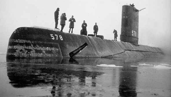
This was not high summer. It was in mid March, only the first month of Spring. Such thin ice, so much loose water around, so early in the year. Surely that must be the dreaded Global Warming?
The vessel is the USS Skate, the date is 17th March, the year is 1959, 50 million years ago.
Copied from Still Waiting for Greenhouse , 28 Nov. 2000
|
still waiting for greenhouse john daly
The article was meant to indicate that the North Pole had been ice free, even in spring, during the mid-20th century. However, we are not disputing this point here - rather, we examine whether the photograph was indeed of the USS Skate at the North Pole on the 17th March 1959 - i.e. whether the data had been honestly and correctly quoted.
There are two easily-accessible references, which describe the surfacing of the USS Skate at the North Pole on the 17th March 1959 (the first submarine to do so):
- Calvert, J.F., 1959. Up through the ice of the North Pole, The National Geographic Magazine, Vol. CXVI, No. 1, July 1959, pp. 1-41.
- Calvert, J., 1996. Surface at The Pole, Bluejacket Books (originally printed by McGraw-Hill, 1960).
and which say:
- That the sun was still below the horizon and it was quite dark (it did not appear until 19 March):
- The sun was still just below the horizon and a very heavy
overcast made for late twilight darkness
- That the weather was terrible:
- the wind ..... was roaring around us at about 30 knots, blowing the snow until one could see no more than a quarter of a mile
- The swirling snow loomed around the red torches
- in the 26-below-zero cold..... The wind blew snow into our noses and mouths, and it was difficult to talk or even breathe
- The wind and bitter cold made it physically difficult to hold and read the prayer book
- the gale was increasing and the temperature dropping
- Both sides of the lead were piled with the heaviest and ruggedest hummocks I had yet seen in the Arctic. It was a wild and forbidding scene
Do these descriptions match the picture above? Of course not. After a long argument, John Daly was eventually
persuaded to remove the picture from his web site. It turned out that he had absolutely no evidence to prove
that the picture was of the Skate at the North Pole on the 17th March 1959 - it wasn't - it was just a
convenient photo, chosen to `prove' the point he was trying to make. His `data' was just plain wrong.
2. Misrepresent or Misinterpret Information
There are rich pickings here. The information is often presented correctly, but a few minutes of consideration, or a delve into the papers(s) or data quoted, will often show that the conclusions drawn by Still Waiting for Greenhouse are either a misrepresentation or a misinterpretation.
Example 1: Average Global and U.S. Temperatures - the Case of the Expanding Axis
For a long while, Still Waiting for Greenhouse showed the following:
|
`Global Mean Temperature' - Disputed Data
|
 The `Surface Record'
It's not really a record at all, but a statistical
composite from station records from all over the world, most of them from
towns and cities, and most from countries which do not maintain their stations
or records properly.
This record is compiled by the Goddard Institute (GISS)
in the US. It indicates a global warming of +0.8°C. Is
it real? Or is it just a statistical product of urban warming skewing the
data, and bad site management in non-OECD countries?
The pre-1940 warming is widely regarded to have been caused by the warming sun during the earlier part of
the 20th century.
|
 |
|
The U.S. Record
This is the composite record from hundreds of weather
stations in the 48 states of the contiguous USA., the early 1930s being
the hottest years of the 20th century. This is completely at variance with
the GISS global record shown above.
Is the US record a better reflection of the global
picture? Urbanisation has been more successfully corrected for in the US
than in the rest of the world.
The US has the best maintained network of weather stations
in the world, and this must surely be a better representation of the global
picture too. The US record also agrees with the satellites (below)
|
|
Copied from Still Waiting for Greenhouse , 23 September 2003
|
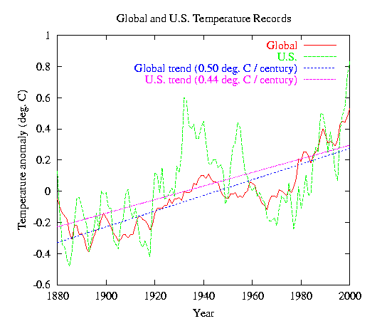
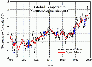
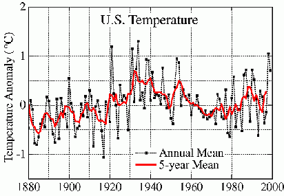
The important things to notice are the different temperature scales used in the above figures; on the upper plot, one degree Celsius covers over twice the vertical distance that it does on the lower plot. This tends to flatten out the trend shown by the U.S. record. If, instead, we plot the two records on the same scale, we get a very different picture (the curves show the 5-year mean values, while the trend lines are based on the annual values, and the records are slightly more up-to-date than the ones shown in Still Waiting for Greenhouse):
It is clear that, when plotted on the same scale, the global and U.S. records are very similar - not
`completely at variance', as claimed by John Daly. Their trend lines (fitted by linear regression)
differ by only 13%.
So, remember what John Daly said about the U.S. record: `The US has the best maintained network of weather
stations in the world, and this must surely be a better representation of the global picture too.' So he
was asserting that, since 1880, global temperatures have been rising at a rate of around 0.44 deg C / century!
(My thanks to Barton Paul Levenson for bringing this to my attention.)
Example 2: Datum Shifts in the Hobart Tidal Record
On 31 May, 2003, Still Waiting for Greenhouse produced a monumental piece of misinformation with this article under Station of the Week:
|
This Week - Sea
Level at Hobart, Tasmania
|
Just one station this
week, Hobart, Tasmania, on my home island, except this time it is not
temperature which is presented but monthly mean sea level at Hobart
between 1960 and 2000. Data comes from the Permanent Service for
Mean Sea Level.
Regular visitors to this
site will be familiar with the sea level issues surrounding the Isle of
the Dead at Port Arthur close to
Hobart. Since sea level trends at Hobart and Port Arthur cannot
deviate from each other by much due to their respective harbours being
directly adjacent, then sea level trends at Hobart (or
lack of such trends) have direct relevance for similar trends at
the Isle of the Dead.
A recent paper in Geophysical
Research Letters made direct reference to Hobart sea levels in the
course of arguing a position on historical sea levels at the Isle of the
Dead. However, Hobart shows no sea level rise over the 40 years of
this record - which also means that sea level at the Isle of the Dead
could not have risen either. However, that is not the end of this
intriguing story.
Watch the main page for
new developments on the Hobart / Isle of the Dead sea level issue.
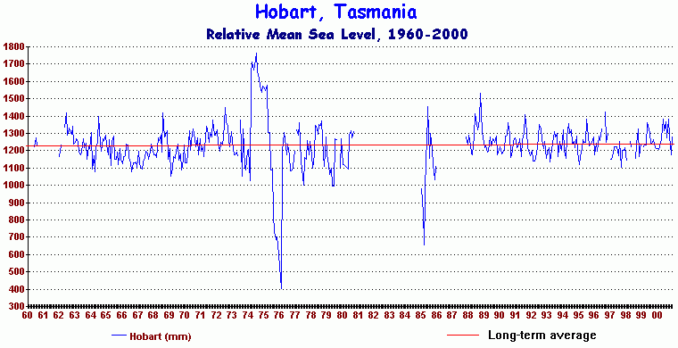
|
Copied from Still Waiting for Greenhouse , 2 June 2003
|
This particular record (coded 680/201) was obtained from the Permanent Service for Mean Sea Level in the U.K.
It carries the caveat that, because accurate survey information has not been used to provide the necessary
vertical reference (which often varies in time due, for example, to relocation of the tide gauge),
`It is a good general rule, therefore, that (the data) should NEVER be used for time series analysis or for
the computation of secular trends'. However in this case John Daly threw caution to the wind, fitting a
trend line to the data and pronouncing that `Hobart shows no sea level rise over the 40 years of this
record'.
So, let's look at the record in more detail. The record shows a number of what are called `datum shifts'. These are clear steps in the record that are significantly larger than we would expect for normal changes in sea level. They are generally caused either by adjustments made to the tide gauge or by a complete relocation of the instrument. The Hobart record is well known to have a number of such datum shifts. Here are examples of obvious ones shown in the above plot (there are very probably other ones that are not so visually obvious, but which would still significantly corrupt any estimation of the overall trend):
- About 1974: a vertical shift of about 0.6 metres
- About 1976: a vertical shift of about 0.9 metres
- 1974-1976: several vertical shifts covering a total of about 1.3 metres
- Around 1985/1986: a vertical shift of about 0.8 metres
If such datum shifts are not allowed for (generally by applying adjustments to the data based on calibration
and survey results), then a record such as this cannot be used for trend estimation. John Daly's statement
that `Hobart shows no sea level rise over the 40 years of this record' was therefore completely without
foundation.
It is somewhat surprising that John Daly, who apparently pretended to have some knowledge in these matters,
should have made the elementary mistake of missing such large datum shifts. Did he really believe that mean sea
level at Hobart can vary by over half a metre from year to year, and in an extreme case, fall by 1.3 metres
from 1974 to 1976?
It is also interesting to investigate John Daly's claim that the record `shows no sea level rise over the
40 years of this record' (bearing in mind that the actual trend is meaningless, due to the known datum
shifts - this is just a test of what John Daly meant by `no sea level rise'). The trend of the data shown
above is in fact 0.8 mm/year, which only just below the lower bound of the IPCC's estimate for global
average sea level rise for the 20th century of 1-2 mm/year
(
Climate Change 2001: The Scientific Basis). So, in Daly-speak, `no sea level rise' could mean
`about the same size as the observed rate of global sea level rise'!
Example 3: The Urban Heat Island Effect
On 28 May, 2003, Still Waiting for Greenhouse came up with the following article (with a postscript on 2 June 2003):
|
rTu-r(max)
= 1.42 log10(POP)-2.09
(28 May 03)
There's nothing so authoritative-looking as
a mathematical formula. It proclaims exactness, precision, and appears
more credible than mere words, even where the reader might not understand what
the formula says.
This particular formula comes from a paper
published in the Australian Meteorological Magazine (v.50, 2001, 1-13) titled `Urban
Heat Island Features of Southeast Australian Towns', authored by Torok
et al. The formula is the outcome of a study by four researchers into
the magnitude of heat island effects in four small towns in south-eastern
Australia and states a general rule for estimating urban heat islands in such
towns from local data.
The authors acknowledged that Melbourne (3 million+ population) had a maximum urban-rural
temperature difference (Tu-r(max)) of 6.8�C based on a previous
study, and that even Hobart with only 130,000 people had a Tu-r(max) of 5.7�C. That effectively damns all large and medium size cities
as credible places from which to detect the fractions of a degree changes
needed for detection of genuine climate change.
But what of the small towns? Torok et
al. tested Hamilton (pop. 9,753), Colac (pop. 9,171), Cobden (pop. 1,477)
and Camperdown (pop. 3,315). The
results showed differences between town and rural to vary between 1�C and
5.4�C. The researchers also found a significant difference between
measurements taken over concrete and taken over grass, the heat island being
moderated if the weather box is located on a grassy expanse.
These small towns have populations which
would designate them as `rural' in the CRU and GISS datasets and yet have
significant heat islands which would invalidate their use as places to detect
climate change using local temperature data. The data from all these
towns would remain uncorrected for heat islands even though the phenomenon is
running into urban-rural differences of whole degrees for all of them.
The authors concluded -
"these results
imply that climatological stations in large cities should preferably be
excluded from studies into long-term climate change, and those in small towns
should be located away from the town centres."
It's about time the IPCC and the keepers of
the surface data, CRU and GISS, took the urban heat island seriously enough to
review all weather records from around the world and make a thorough purge of
those records emanating from not only large cities, but also from small
towns. Since even small Australian towns are shown to have a significant
urbanisation distortion to the data, then the more tightly packed towns of
Europe and North America will show even more severe effects.
To promote `global warming' to the public,
the public must be first assured that the data they are presented with is not
simply an aggregate of thousands of localised urban warmings. `Greenfields'
stations are few in number, but collectively they would present a more
accurate picture of climate trends than do the hopelessly contaminated data
from urban areas, even the small ones.
The paper itself was originally submitted to
Australian Meteorological Magazine in December 1998 and was not
published until March 2001 - a very long time lag between submission and
publication, even for that journal. This contrasts with the eager
fast-tracking that pro-warming papers receive from the major journals.
Postscript (2 June 03) - I am
grateful to Miceal O'Ronain who charted the above formula. The result is
quite startling. The formula says that the biggest heat island effect
occurs with the first 5,000 people or so, the incremental effect tailing off
as population rises. It means that even the smallest towns have heat
islands almost matching large cities. Since this formula is specific to
Australian towns, the effect would be even more pronounced in the more densely
packed towns of Europe and North America. It is little wonder that neither the IPCC nor the institutions
which collate surface records are keen to have heat islands addressed in any
serious way. To do so would invalidate the whole notion of a +0.7�C
temperature rise during the last century and thereby undercut the whole
rationale for the massive `global warming' industry. 
Copied from Still Waiting for Greenhouse , 6 June 2003
|
Firstly, the reader is led to believe that results of this type are new. On the contrary, the paper by
Torok et al. is a review of work stretching back to 1972, with some new observations made in the early 1990s.
Secondly, John Daly's article gave the distinct impression that the paper indicates that records used `for
detection of genuine climate change' from cities of the size of Hobart or Melbourne are corrupted by urban
heat island (UHI) effects as large as 6 or 7 deg. C. However, the crucial word in the formula that forms the
title of John Daly's article is `max', which signifies that the equation quoted and plotted in John
Daly's article is the maximum observed urban-rural temperature difference -- i.e. not the
average urban-rural temperature difference. Here a few quotes from Torok et al's paper:
I think these quotes speak for themselves.
Example 4: Sea Level at Tuvalu
In March, 2003, Still Waiting for Greenhouse carried the following article:
|
Tuvalu - Pacific Islands Crying Wolf
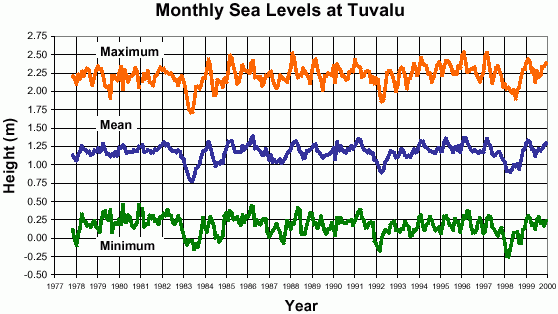
The Government of Tuvalu, egged on by GreenPeace, is the most strident of small Pacific island countries, claiming they are being swamped by rising seas caused by global warming. Predictably, they are after `compensation' from the United States and Australia. But tide data from Funafuti, the capital of Tuvalu, data collected with Australian expertise and equipment, shows their claims to be both alarmist - and false.
(Data from the National Tidal Facility (NTF), Adelaide)
Copied from Still Waiting for Greenhouse , 15 Mar. 2003 (part of article only)
|
still waiting for greenhouse john daly
The reader is led to believe that the above graph shows no sea level rise at Tuvalu. Now, the IPCC report, Climate Change 2001: The Scientific Basis, provides an estimate (based on observations) for the global average sea level rise for the 20th century of 1-2 mm/year. Now, 1-2 mm/year over the length of the above record (22 years) would amount to a total rise of 0.022-0.044 metres, roughly equivalent to the thickness of the blue (`Mean') line on the graph. Would you be able to tell, just from looking at the graph, whether the overall rise was of this magnitude? Of course not - the variations (the `noise') in the record would effectively mask any rise that is comparable with the IPCC's figures for global average sea level rise. In fact, a detailed analysis of the observations from Tuvalu ( A Note on Relative Sea Level Change at Funafuti, Tuvalu) shows that the trend of the blue (`Mean') line on the graph is over 2 mm/year (using a slightly longer 24-year record) - larger than the range of global average rise estimated by the IPCC. However, it has been shown that the tide gauge at Tuvalu is actually sinking at about 1 mm/year, so that the rate of sea level rise relative to the major land mass of the island of Funafuti is just over 1 mm/year - i.e. entirely consistent with the IPCC's figures for global average sea level rise of 1-2 mm/year.
John Daly was told more than once about the above report on Tuvalu, but steadfastly refused to change the information
on his web page.
Sea level records show considerable variation over a wide range of time scales - from the waves that lap on the shore every 5 or so seconds to variations with cycles that are a decade or so in duration. If we are to estimate any long-term trend (i.e. something that may last for, say, a century) we need long records of sea level. Douglas (2001) estimated that a sea level record should be at least 60-70 years long in order to yield a reliable estimate of any long-term trend. The record from Tuvalu is 24 years long, and hence the above estimates of long-term sea level rise are subject to an undesirably large error (+/- 0.8 mm/year). However, longer records from all over the world have indicated that the global average sea level rise very probably lies within the range 1-2 mm/year. The best we can say about the long-term sea level rise at Tuvalu, based on a rather short record, is that it is entirely consistent with the global average.
Another article on Tuvalu in Still waiting for Greenhouse carries a similar message.
Read more about Tuvalu later
3. Use Selected Data (`Cherry Picking')
Weather and climate are highly variable, both in time and space. If we allow ourselves the luxury of subjectively selecting which data we accept and which data we reject, then we can `prove' almost anything!
Example 1: Weather Station(s) of the Week
To use a record from a single meteorological station as evidence for or against climate change is about as silly as
suggesting that we can describe the climate of the Southern Hemisphere from observations made only in Hobart.
However, Still waiting For Greenhouse regularly carries an item called Weather Station(s) of the Week
in which is generally shown the long-term temperature observations from one or two weather stations. They are
presumably selected to make a particular point. Now, a recent published estimate of global temperature rise during
the latter part of the 20th century was based on observations from over 4000 objectively selected stations.
Even if John Daly objectively selected his own stations (and there is absolutely no evidence that he did),
it would still have taken him around 50 years (at one or two stations per week) to present us with data that was reasonably
representative of the global picture!
Example 2: The `Shortt' Observation and the Tasmanian State Datum
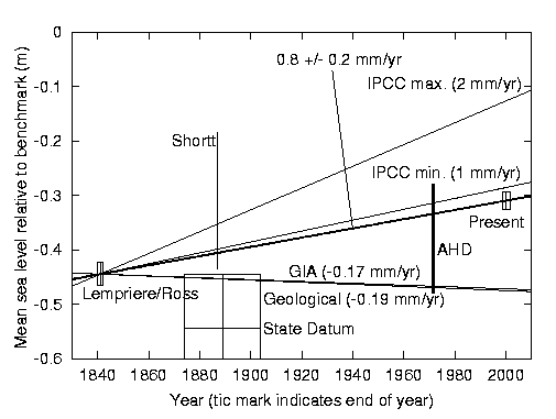
In March, 2003, Still Waiting for Greenhouse carried an article entitled Tasmanian Sea Levels: The `Isle of the Dead' Revisited in which appeared the following figure:
still waiting for greenhouse john daly
|
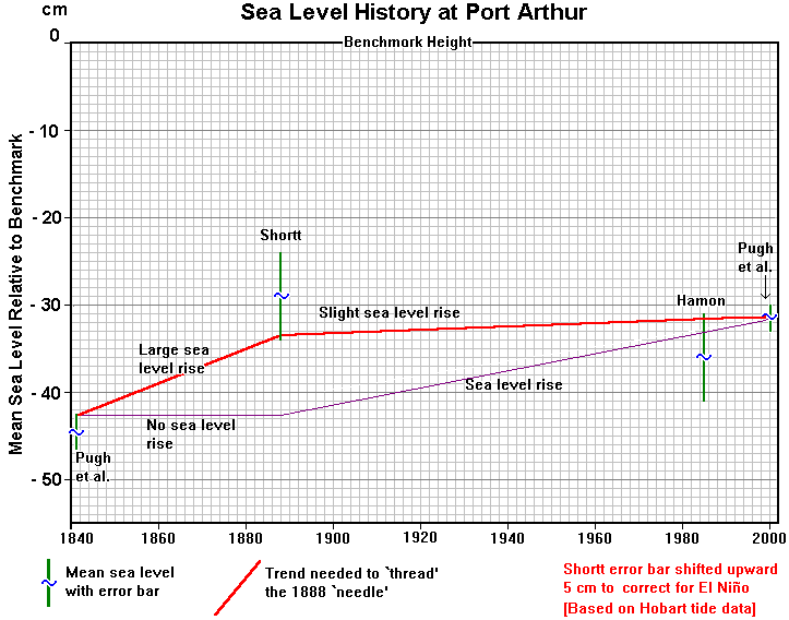
Fig.16 - The Pugh and Alternative scenarios compared - with previous revisions included
Copied from Still Waiting for Greenhouse , 18 Mar. 2003 (part of article only)
|
still waiting for greenhouse john daly
This figure is John Daly's interpretation of the various observations of sea level made at Port Arthur between 1841
and the present. The centre of each vertical green line represents an observation, and the length of the line
indicates the uncertainty of the observation. We will just concentrate on the single observation made by Captain
Shortt on 24 February 1888 (marked as `Shortt' in the figure), which shows mean sea level to be 29 cm below the
benchmark. If John Daly had `allowed' this point to be any lower, it would have implied a significant rise in
sea level from 1888 to the present.
There is, however, another observation which Daly omitted to mention, although he actually knew all about it. It was
the subject of much of a talk given in Hobart on 22 January 2003, and which was attended by John Daly. John Daly was
also allowed to tape the talk, so he had a record of all that was said. The observation in question is the Tasmanian
State Datum, which was based on mean sea level in Hobart during the period 1875 to 1905 (which, coincidentally, is
centered on 1890, very close to the `Shortt' observation). This datum, when transferred to Port Arthur, is 54.5 cm
below the benchmark, with an estimated uncertainty of +/- 10 cm (mainly related to levelling uncertainties between
Hobart and Port Arthur). When added (as the thick green line) to the above figure it looks like:
|
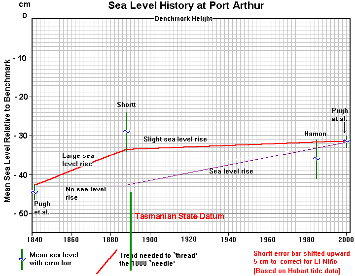
Adapted from Still Waiting for Greenhouse
|
still waiting for greenhouse john daly
Now John Daly really had a problem. In order to reduce the apparent sea level rise during the 20th century, he had
already moved the `Shortt' observation up by 5 cm (which he justifies as an attempt to `correct for El Nino') and
reduced the uncertainty to a figure that was less than half the uncertainty expected for a single (tidally adjusted)
observation of sea level in this area (Hunter et al., 2003). The result was a large gap between the observation
of Shortt and the Tasmanian State Datum. Now it should be noted that the `true' value associated with each observation
does not have to lie within the uncertainty range shown - there is, in fact, about a 68% chance that it does
(assuming that the uncertainties represent plus or minus one standard deviation). However, the further we move away
from (and out of) the uncertainty limits, the less likely it is that we are located at the `true' value. In the above
figure, the gap between the observation of Shortt and the Tasmanian State Datum is so large that any position
for the `true' sea level is highly improbable. This inconvenience was no problem to John Daly, however - he just
`picked the cherry' that suited him (the `Shortt' observation) and ignored the other one (the Tasmanian State Datum).
All the observations can, however be reconciled if the various levels and uncertainties are selected objectively. The
figure below is copied from the paper by Hunter et al. (2003):
still waiting for greenhouse john daly
Here each observation is shown by a rectangle, the height and width of which represent the uncertainty(+/- one standard
deviation) and duration, respectively. The line marked `0.8 +/- 0.2 mm/year' is the line that passes through the
`Lempriere/Ross' and the `Present' observations. This line passes within 1.5 standard deviations of all the observations
and is therefore highly likely and a good representation of the average sea level rise at Port Arthur from 1841 to the
present.
Postcript 1:
On 11 June 2003, John Daly mounted a new attack on
this study. Here is a reply which addressed his claims.
Postcript 2:
John Daly's
`last paper' (22 February 2004) is a sad
and pathetic epitaph to the creator of Still Waiting for Greenhouse. It attempts to argue that the
simple rejection of his manuscript
(a Comment, criticising Hunter et al. (2003) and submitted to
Geophysical Research Letters) is evidence that climate science is politically corrupt,
and that the peer review system has `become a vehicle for censorship' by the `Greenhouse Industry'.
All scientists feel hurt, and perhaps angry, when the results of their work are rejected
by a journal but few would resort to the grandiose claims of the `last paper'.
The `last paper' neither needs, nor indeed deserves,
further comment.
4. Use Short Data Sets or Data From a Small Region
As noted above, weather and climate are highly variable, both in time and space. We therefore cannot make sense of long-term global changes in climate without considerable averaging of observations in both time and space.
Example: The `Isle of the Dead' - Zero Point of the Sea?
From September 1999 until recently, Still Waiting for Greenhouse carried a story entitled The `Isle of the Dead' - Zero Point of the Sea? about observations of sea level change at the Isle of the Dead, Port Arthur, Tasmania. In 1841, at the instigation of the explorer, James Clark Ross, a historic benchmark was placed on the Isle of the Dead. This mark was related to several years of tidal measurements made by Thomas Lempriere, the Deputy Assistant Commissary General at Port Arthur, around the same time. These observations have been used to estimate the change in sea level over the 160 years that have elapsed until the present time, the results being reported in two peer-reviewed articles in the scientific literature (Hunter et al., 2003; Pugh et al., 2002). The article in Still Waiting for Greenhouse came up with a different interpretation of the observations - but that does not concern us here. What is of concern is the question: how is an estimate of sea level change made at one point related to the global average sea level change? Now, the estimate of global average sea level, quoted in Climate Change 2001: The Scientific Basis was based on 17 published papers, contributed by 16 scientists. Each paper was based on a careful selection of a large number of sea level observations. The papers resulted in 15 estimates of sea level rise, from which was derived the estimate of 1-2 mm/year for the 20th century. As an example, one of these papers was by Douglas (1997), who used 24 stations, all with records longer than 60 years, and with an average length of 83 years. For comparison, Douglas had access to a `pool' of roughly 1000 tide gauge records from around the world.
So, the `IPCC estimates' of global average sea level rise have been based on a careful selection of tide gauge records, involving the rejection of around 98% of the records as unsuitable. What would be the implication of one `new' long-term observation of sea level change? Well, here is what Still Waiting for Greenhouse had to say regarding the observations from Port Arthur:
|
How
does this relate to Global Warming today?
The IPCC, in their
1995 Report, clearly stated that sea levels had already risen 10-25
centimetres this century. It is a claim which has been repeated
numerous times as part of the Kyoto Protocol politics.
But when we look at
the Ross-Lempriere 1841 benchmark, regardless as to how its meaning is
interpreted, no matter what the plaque might have said, one thing is clear.
There has
been no sea level rise this century - none at all.
The benchmark was observed
by myself a few weeks ago, observed by Hamon [4]
in 1985, by Captain Shortt in 1888 [10],
and in each case the benchmark was about the same height above mean sea
level - about 30 centimetres. In this regard, the greenhouse industry finds
itself in a lose-lose situation, which may explain why it has not
been publicised in spite of extensive scientific effort and interest.
Whether or not we go
the one further step and acknowledge the possibility that there was a significant
sea level fall before 1890 does not alter the central message of
the `Isle of the Dead' -
The IPCC
sea level claims are false.
Copied from Still Waiting for Greenhouse , 16 Sept. 2000 (part of article only)
|
still waiting for greenhouse john daly
Now, we can actually test what the effect would be of including, say, a sea level fall at Port Arthur into the
estimate of Douglas (1997). Over the years, John Daly made a number of claims about the height of mean sea level
relative to the benchmark in 1841, but most of his arguments basically put mean sea level near the benchmark
at that time. For the sake of argument, let's put mean sea level exactly at the benchmark in 1841, in which case it is
now about 0.31 metres lower than it was then (relative to the land). This implies an average rate of fall of
1.9 mm/year over the intervening 160 years. If this figure is adjusted for a vertical rise of the land of about
0.2 mm/year (this is the figure assumed by Hunter et al., 2003), we arrive at an absolute rate of fall
of mean sea level of 1.7 mm/year. So, let's now incorporate this `new' observation into the estimate of Douglas (1997),
who used 24 stations spread over the world, with records longer than 60 years. He grouped the stations
into regions, prior to taking the final average, so as to improve the
accuracy of the estimate. Since there was no contribution for Australia
in Douglas's figures, let's place Port Arthur in the `New Zealand' region, and re-calculate the average. The result is a change of Douglas's original
value of 1.83 mm/year to 1.76 mm/year - a change of less than 0.1
mm/year!
So, how on earth can Still Waiting for Greenhouse claim that the `the central message of the Isle of the Dead'
is that `The IPCC sea level claims are false'?
The above claim from Still Waiting for Greenhouse is a bit like the following example: I take 25 numbers that
are similar, but of not exactly the same value. I then hold back one number (the `Port Arthur' number)
and ask you to take the average of the remaining 24 numbers. After you have done this, you tell me the result. I then
say `your average must be false, as it doesn't agree with this number that I withheld in the first place'. The argument
is nonsense, isn't it? There is no rule that says that the numbers that contribute to an average have to have the
same value as the average.
5. Say `It's All Due to .....'
Still waiting for Greenhouse presently (March, 2003) carries an article with the following title:
|
SOLAR
ACTIVITY: A
DOMINANT FACTOR IN CLIMATE DYNAMICS by Dr
Theodor Landscheidt Schroeter
Institute for Research in Cycles of Solar Activity Nova Scotia,
Canada
Copied from Still Waiting for Greenhouse , 21 Mar. 2003
|
still waiting for greenhouse john daly
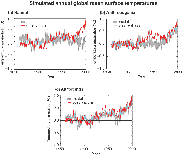
The `spin' here is to make us believe that the observed climate change is all caused by variations in the strength of the sun's radiation. However, climate modellers acknowledge that, while the sun's variation is important, so too is the effect of anthropogenic emissions of greenhouse gasses. It is not a case of one or the other being important; both effects are important. Here is a figure from Climate Change 2001: The Scientific Basis:
still waiting for greenhouse john daly
The top left-hand graph shows the predictions of a climate model (grey line)where the long term variations are forced only by natural processes (solar variation and volcanic activity), with the observations shown in red. It is evident that some features of the observations and predictions agree quite well, although there is significant disagreement at other times. In particular, the model fails to simulate the significant rise in temperature since about 1975.
The top right-hand graph shows the predictions of a climate model (grey line) where the long term variations are forced only by `anthropogenic' effects (anthropogenic greenhouse gases and an estimate of sulphate aerosols). As with the first graph, there are some periods of agreement and some periods of disagreement. However, this second graph shows that the model simulates quite well the observed temperature rise since 1975.
The lower graph shows the results of the simulations of a model forced by both natural and anthropogenic effects. It is evident that the agreement between simulations and observations is much better than in either of the first two graphs.
So, simulation of annual global mean surface temperatures requires the inclusion of both natural effects (e.g. those due to solar variability) and anthropogenic effects (e.g. those due to anthropogenic greenhouse gases). Both types of effect are important.
What is Happening and What May Happen at Tuvalu?
There have been numerous reports of flooding and associated problems (e.g. salinity) at Tuvalu. This increase in
flooding events may be attributable to global warming or it might not - we just don't know at the moment. Also, it may
not be a long-term trend but just part of a long cycle (possibly only repeating after decades) - again we don't know.
The problems of sea level rise and salinity at Tuvalu are complex and can have a multitude of causes. Apart from global
warming and multi-decadal cycles of sea level change, other influences are higher waves due to stormier conditions,
reduced rainfall, increased erosion due to some other factors, and possible poor management practices on the islands
(e.g. too much fresh water usage, or building in unsuitable places). Some or all of these factors will be playing a
part. The sea level record shown by John Daly and the
analysis of the long-term trend in mean sea level
are just parts of the story. However, let us just consider (in a series of steps) the long-term trend in mean sea level,
and its possible consequences, for Tuvalu:
- The `IPCC' estimate (from Climate Change 2001: The Scientific Basis) of global average sea level rise for the 20th century is 1-2 mm/year.
- While 1-2 mm/year is large in the context of the recent history of the Earth (this is arguably the highest rate of rise for the past 6000 years) it is not very large in practical terms - even low-lying islands would probably be able to adapt to a rise of 10 - 20 cm each century.
- The `IPCC' estimate of 1-2 mm/year is broadly understandable by scientists in terms of present theories of the rate of warming of the oceans, the rate of melting of ice sheets and other factors that effect the amount of water in the oceans. In other words, scientists broadly understand what went on in the 20th century.
- Observations from Tuvalu are not inconsistent with the `IPCC' estimate of global average sea level rise. (Note that there will undoubtedly be some variation of the rate of rise over the globe - it just looks as if Tuvalu is not very far from the average.)
- Since scientists seem to broadly understand what went on in the 20th century, it is not unreasonable to assume that they probably also have it roughly right for the 21st century (as summarised by the IPCC). As regards the IPCC predictions, the uncertainty is much larger - they quote a rate of rise of 0.8 to 8.0 mm/year from 1990 to 2100.
- Since, on the present evidence, the rate of rise at Tuvalu over the 20th century is not inconsistent with the rate of global average rise, it is again not unreasonable to assume that the IPCC predictions for global average rise for the 21st century should also apply roughly to Tuvalu.
- The worst-case prediction for global average rise for the 21st century of 8.0 mm/year, if relevant to Tuvalu, could have disastrous consequences over time. This possibility has to be addressed and managed.
Finally, an excellent site advising you on ways of assessing a web site for reliability.
Useful Links
References
- Douglas, B.C., 1997. Global sea rise: a redetermination, Surveys in Geophysics, Vol. 18, 279-292.
- Douglas, B.C., 2001. Sea level change in the era of the recording tides gauge,
in Sea Level Rise, History and Consequences, Douglas, B.C., Kearney, M.S. and Leatherman, S.P. (eds.), Academic Press.
- Hunter, J., Coleman, R. and Pugh, D., 2003. The sea level at Port Arthur, Tasmania, from 1841 to the present, Geophysical Research Letters, Vol. 30, No. 7, 1401, doi:10.1029/2002GL016813.
- Pugh, D., Hunter, J., Coleman, R. and Watson, C., 2002. A comparison of historical and recent sea level measurements at Port Arthur, Tasmania, International Hydrographic Review, Vol. 3, No. 3 (New Series), 27-46.
still waiting for greenhouse john daly
For further information, to provide comments or to contribute articles, phone 0427 098 831 or +61 427 098 831.
still waiting for greenhouse john daly